Andrew Howell
A complete brand and website redesign for one of Canada's top Realtors.
The Basics
When: Winter 2021 to Spring 2021
What: Freelance Client
Role: Product Designer
The Tools
Adobe Xd
Adobe Illustrator
Adobe Photoshop
Adobe InDesign
The Problem
Andrew Howell is one of the highest-preforming real estate Brokers in Canada. He works with clients to buy and sell homes in the Sarnia-Lambton area and is passionate about the community. His goal was to elevate his digital and in-person client experiences, and that we did. Over the span of roughly five months, I worked with Andrew to completely redesign the look and feel of his brand. It was important that his high-end real estate experiences were reflected both digitally and in print.
“How might we translate Andrew's incredible in-person client experiences that he is known for in to incredible and complementary digital user experiences?”
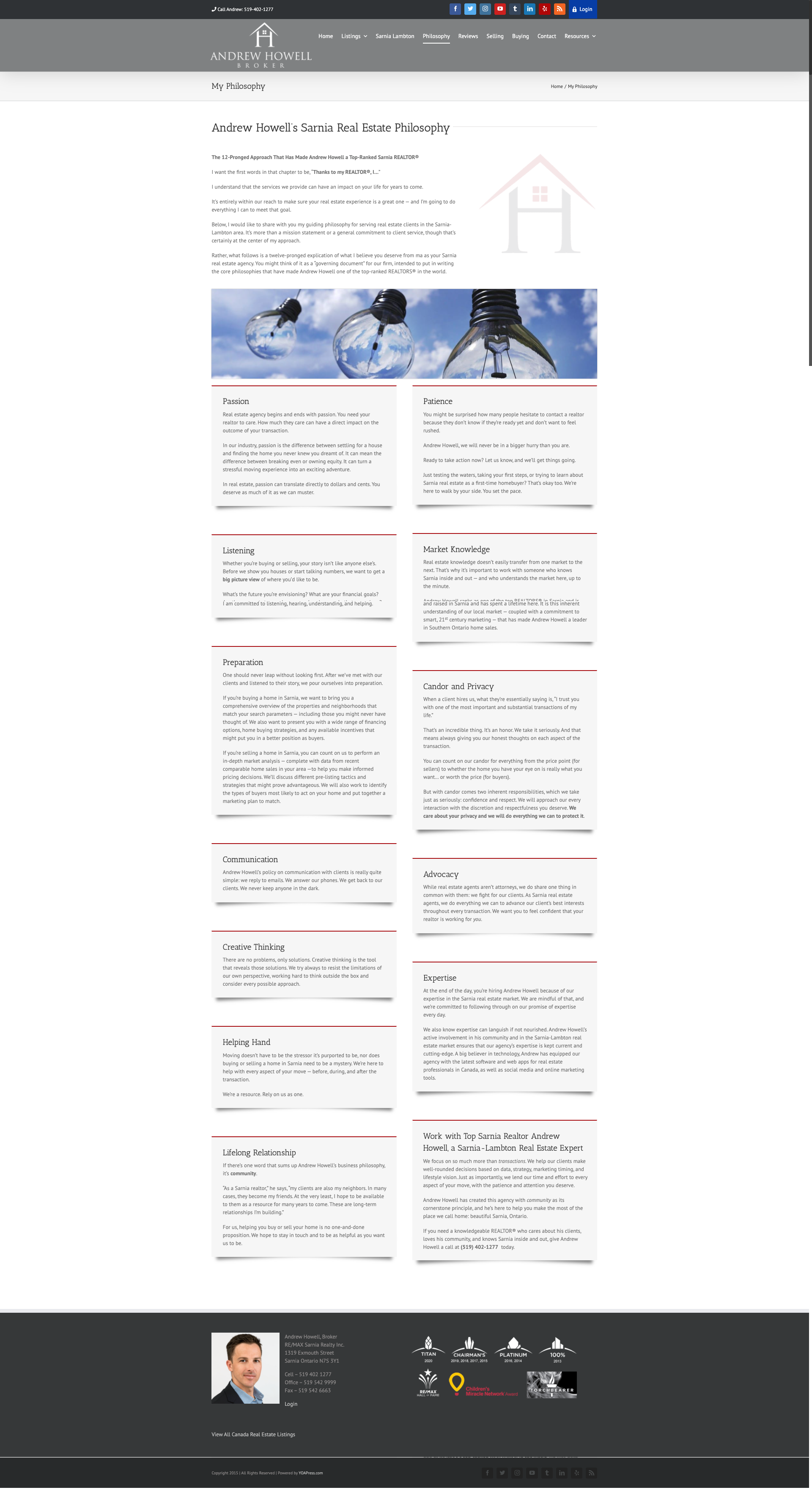
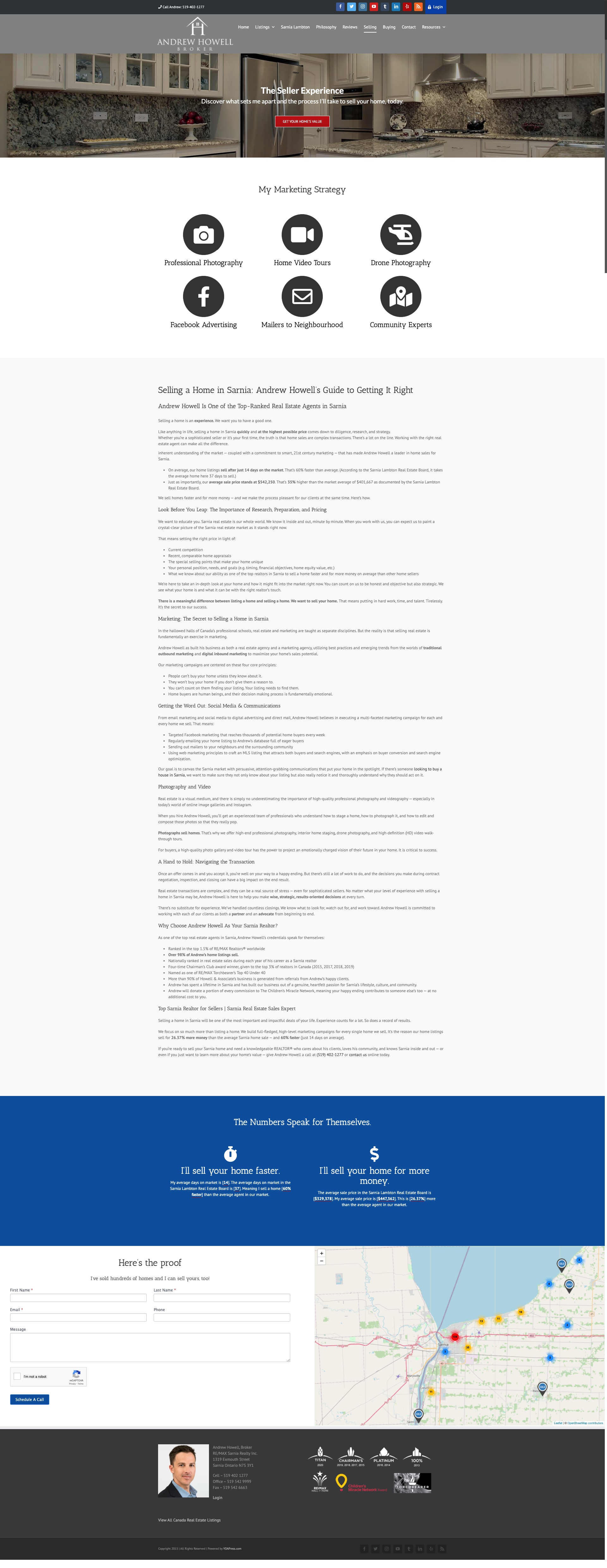
Below is what the old website and branding looked like. The goal was to create a brand and design that was of high-quality.

The Process
1:1 Meeting with Andrew
The first step was to conduct a brand and website audit. I needed to fully understand where the businesses currently was, and where it could be. Part of this step was to have a session with Andrew to discuss how he views his business and how he wants to be viewed digitally. We talked about what things his clients like about him, and what his concerns were.
Andrew's main goal for the business was the acquire more high-end listings. He said that although that was a majority of his clientele, he knew there was still part of the market he was missing.
Below are the top 4 things Andrew wanted his clients to feel when working with him:
1. He has a high level of knowledge and experience
2. He has a strong work ethic
3. He is readily available and accessible
4. Working with him is a prestigious and special opportunity
Client Interviews and Secondary Research
Before chatting with his clients, I generated open-ended and non-leading questions that would help them tell their story. I wanted them to feel comfortable sharing their end-to-end experience with Andrew so that I could truly discover how they felt. Not everyone wants to answer point blank what went wrong, especially when they might have a personally connection with Andrew. Once I finalized the 4 questions, I ran them by Andrew so that he knew what I would be asking and what the goals of the interviews were.
I had ten 30-45 minute phone call interviews with a wide range of clients. Some were close friends with Andrew, some had just seen his name on a Tim Horton's drive thru billboard. There were clients that had both bought and sold with Andrew, as well as some that were older and younger. I typed notes and transcribed direct quotes that I was going to synthesize later for Andrew.
After conducting the interviews, I also did some secondary research. I wanted to understand the real estate market both Canada-wide and locally in the Sarnia-Lambton area. I also researched website and marketing statistics related to real-estate.
Once I gathered all my research, I created journey maps and personas.
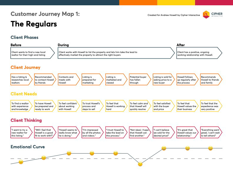

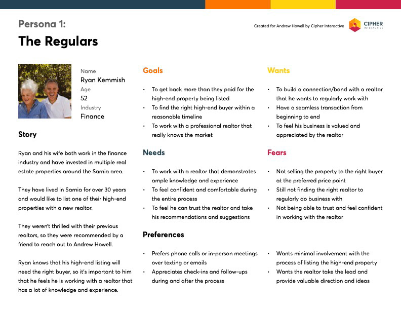
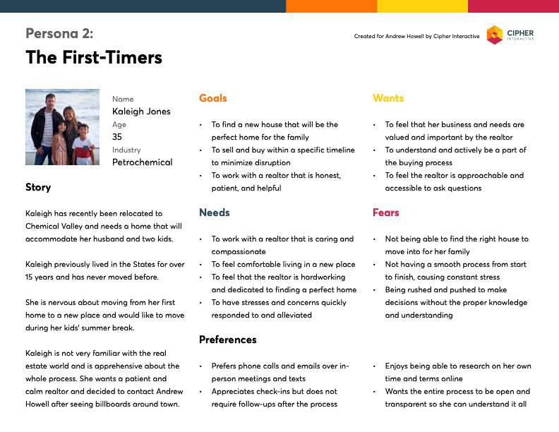
Andrew's clients had a lot of great things to say about him. There were a few comments like "he doesn't need to check in after the sale" here or there, but nothing suggesting any striking issue within the business. Among the many great things, these were the top adjectives Andrew's clients used to describe him (starting from most popular). Interestingly, a lot of the points Andrew wanted his client to feel, they actually did.
1. Calm and Patient
2. Knowledgable and Experienced
3. Professional and Hardworking
4. Fast and Accessible
5. Honest and Trustworthy
Alongside a full-length report containing all my findings and research, I created a slide deck that I presented to Andrew. I wanted to show him the important findings and clearly articulate what they meant and the direction they were pointing towards.


Branding Redesign
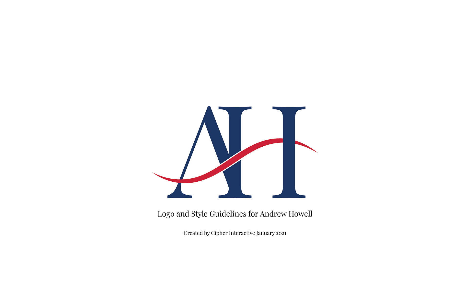
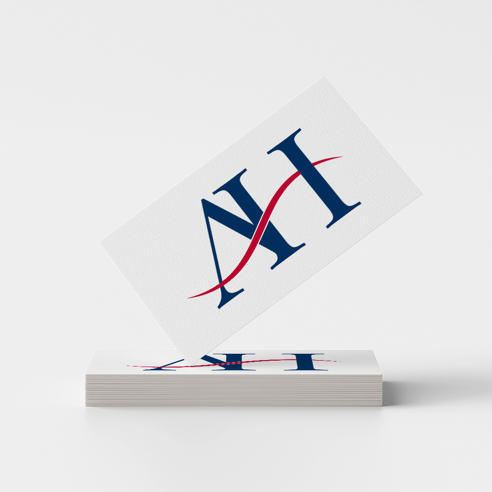
The next step was to do a branding revamp. It was important to evoke feelings that related to Andrew's selected adjectives, as well as the Sarnia-Lambton area. A wide variety of logos were created but not all were presented to Howell. Some were just meant to serve as a warm-up to get the creative ideas flowing.
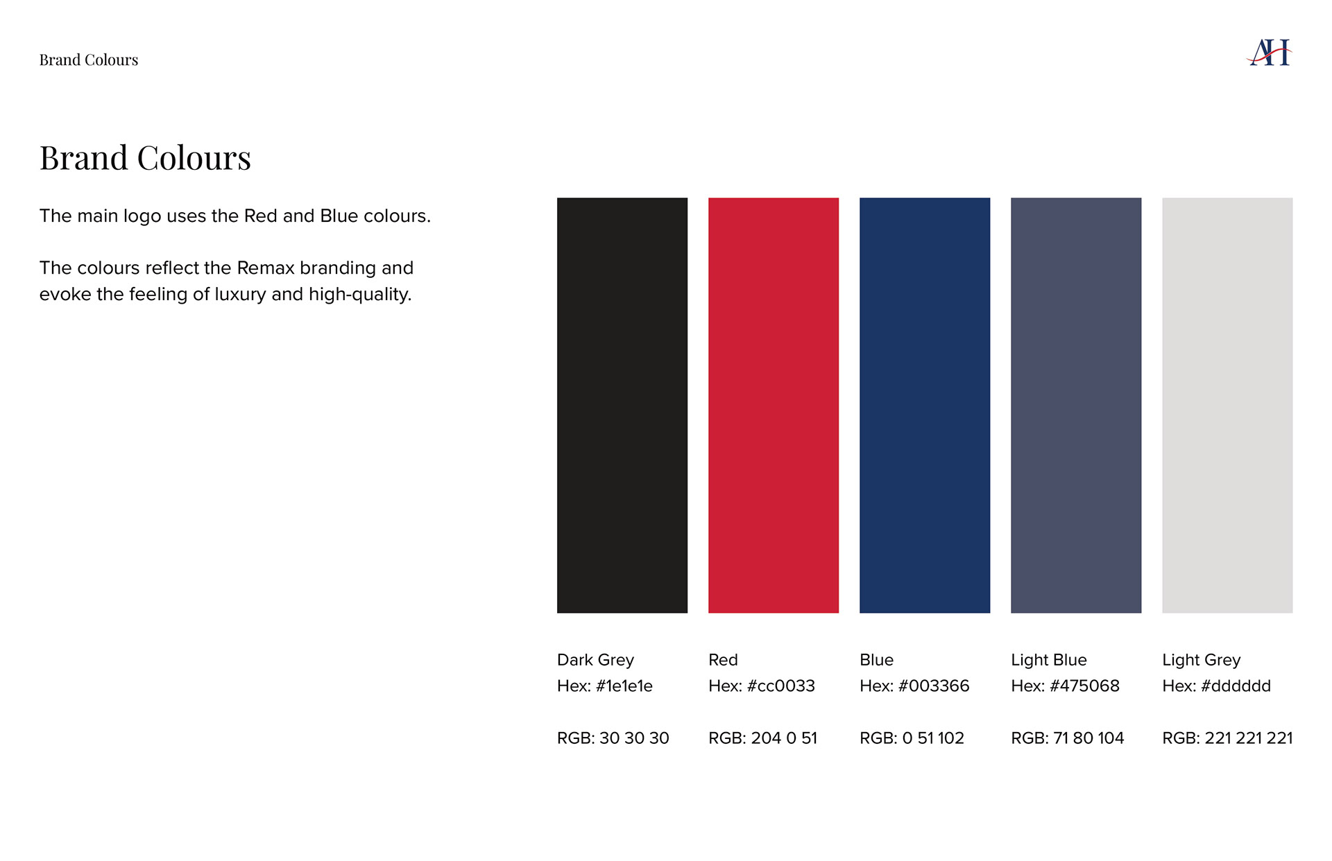
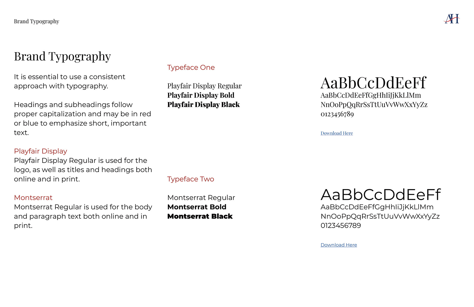
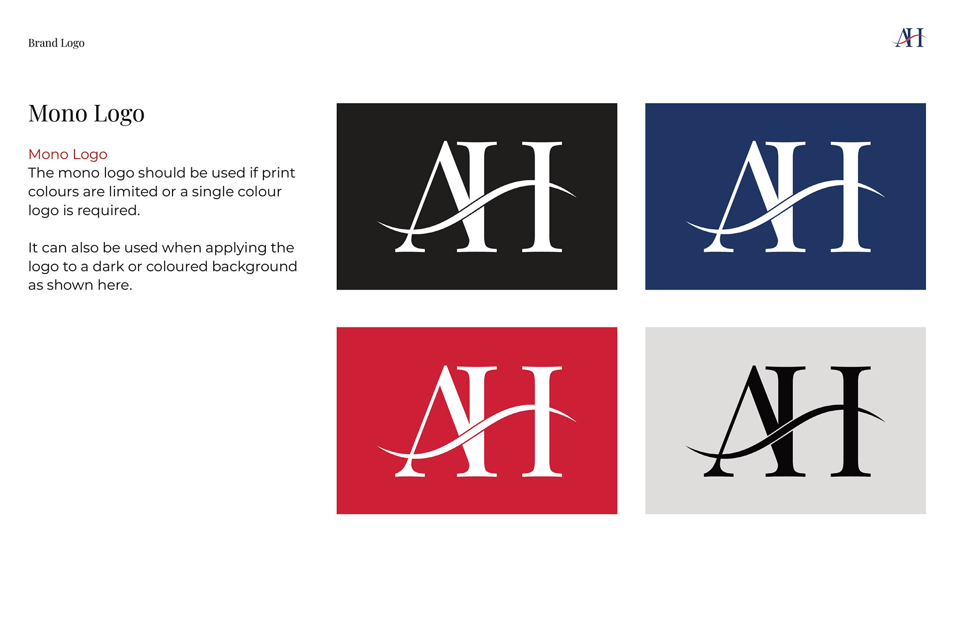
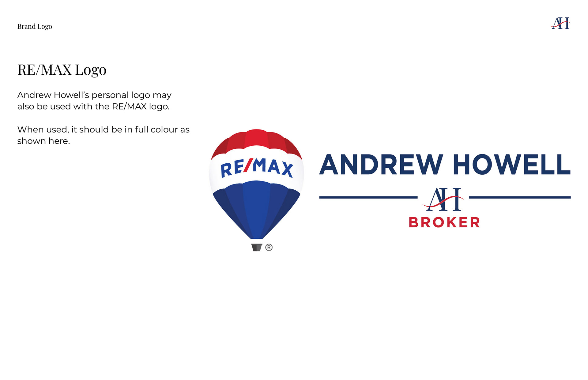
Once the final logo was selected, I created a brand style guide for Andrew and exported all the various versions and file types. The logo was designed using Illustrator and the style guide was designed using Adobe Indesign.

Website Redesign
Once the branding was finalized, it was time to start working on the website. There was a lot of great content on the website already, so I didn't need to do any additional copywriting other than any headings or highlighted phrases. There was however a lot of repeated information so I needed to go through and organize the information architecture.
Next, I started working on building out the wireframes of the entire website.

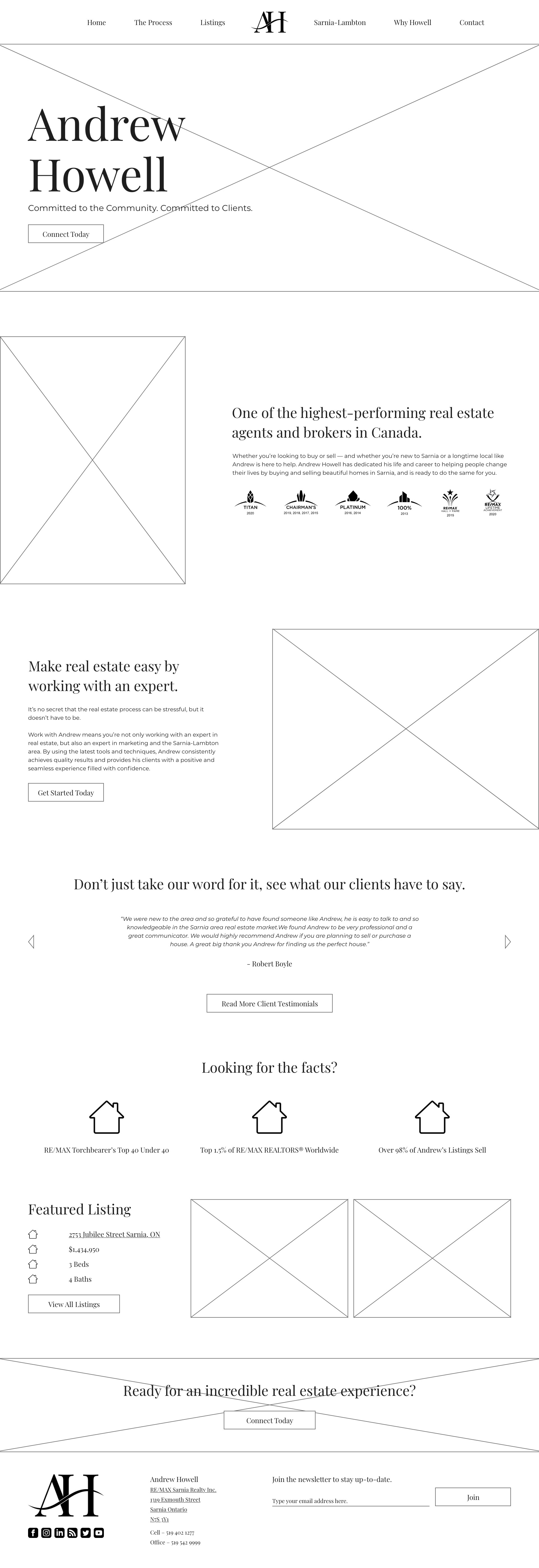

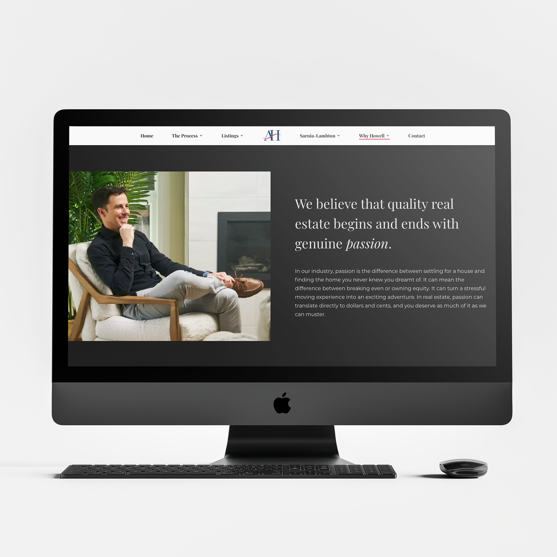
After the wireframes, I presented two directions for the website. Andrew liked them both so we combined the best features of both. Once he was happy, I moved forward with creating high-fidelity mockups. These mockups were directly passed on to the Developer, so I had to make sure they were in perfect shape and format.


The Solution
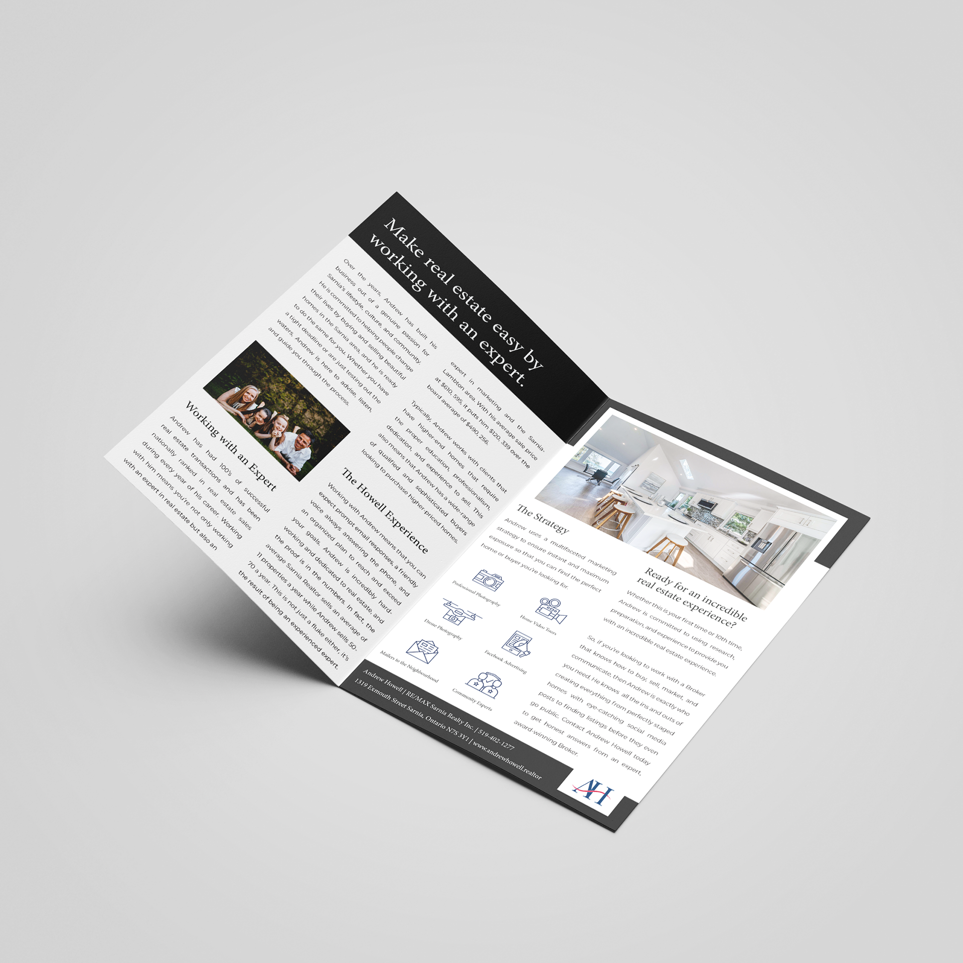
By the end of about 5 months, I had conducted a full user research process with interviews, a completely new brand, and a fresh website design. Andrew was absolutely thrilled with the final products and also asked me to create additional marketing materials such as a brochure and a new signage for his wife's ice cream store that features his active listings. In both the branding and the website, I was able to capture Andrew's high-quality customer experience and love for the Sarnia-Lambton area.



Retrospective
This project was an incredible experience for me as a Product Designer. I got to work on something from end-to-end and had full control over the message and design I wanted to convey. Not only did I get to interview real clients, I also got to apply the data to my work. This project showed me the power of going all in. It showed me that by investing in your business without cutting any corners, you can create something truly outstanding. This project also pushed me a lot as a designer. For instance, I don't typically lean towards logo designs, so for this project I really pushed my artistic and technical skills to create something I am really proud of.
If I was to revisit this project, I would maybe take some time to refine the copy more. It was the area we spent the least amount of time on since there was already so much, but some of it could have been refined to better affect the site's SEO.