The BBC
A mobile and advertisement redesign to reach and retain a younger demographic.
The Tools
Adobe Illustrator
Figma
Adobe Photoshop
The Problem
While studying abroad at the University of Leeds, my design class worked directly with The BBC for 2 months to help them redesign their site with the goal of attracting and retaining a younger user demographic.
The problem statement I created for this brief was:
How might we present The BBC’s digital content in a way that attracts and retains users under 35?”
The BBC’s current personal brand does a great job of reaching a large demographic, but it’s primarily composed of users over the age of 35. Knowing this, they understood that in order to try and reach those under 35, they would have to try something different. That’s why The BBC requested new and fresh designs rather than just improvements to their current branding.
The Process
Since this project focused on a specific user demographic, a lot of primary research was conducted alongside some secondary research. The main methods of primary research were surveys and interviews. For both methods, questions went through an iterative process to eliminate things like biases and leading questions.
Key survey responses were the following:
Some highlights from the survey results were that:
1. Good visual appeal and relevant content were the main factors users considered when deciding if they would revisit a website.
2. Over 65% of respondents felt The BBC’s website was not well-designed.
In addition to primary and secondary research, I created mood boards in my sketchbook to help organize my ideas for the ideation process. After synthesizing my research, it was time to start an iterative ideation process. This involved sketching wireframes and creating high-fidelity mockups.
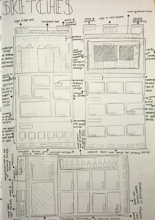

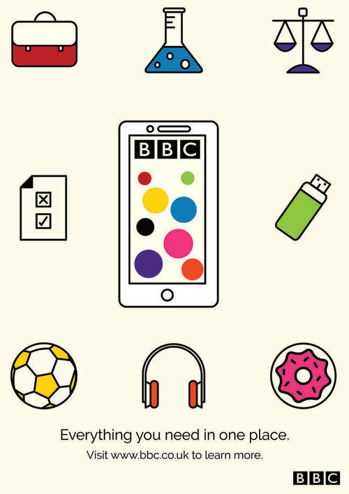
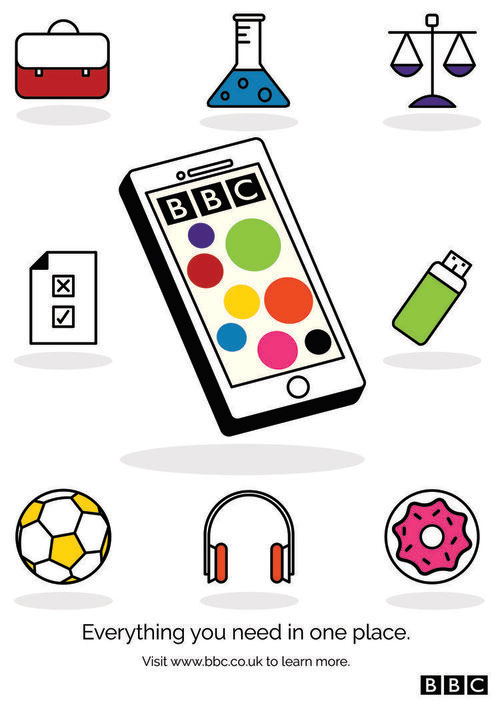
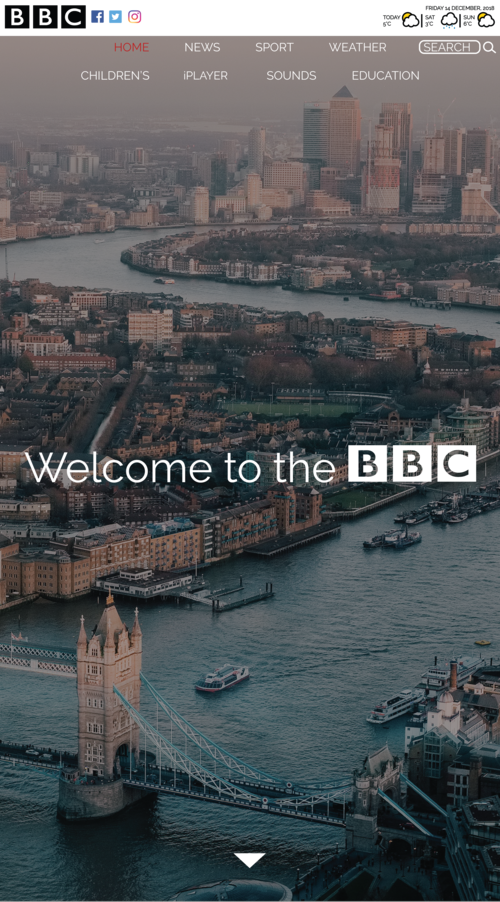
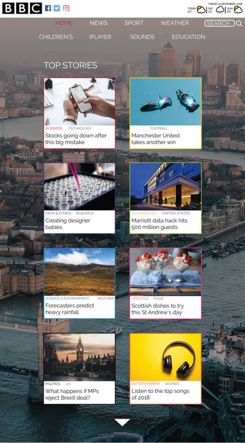
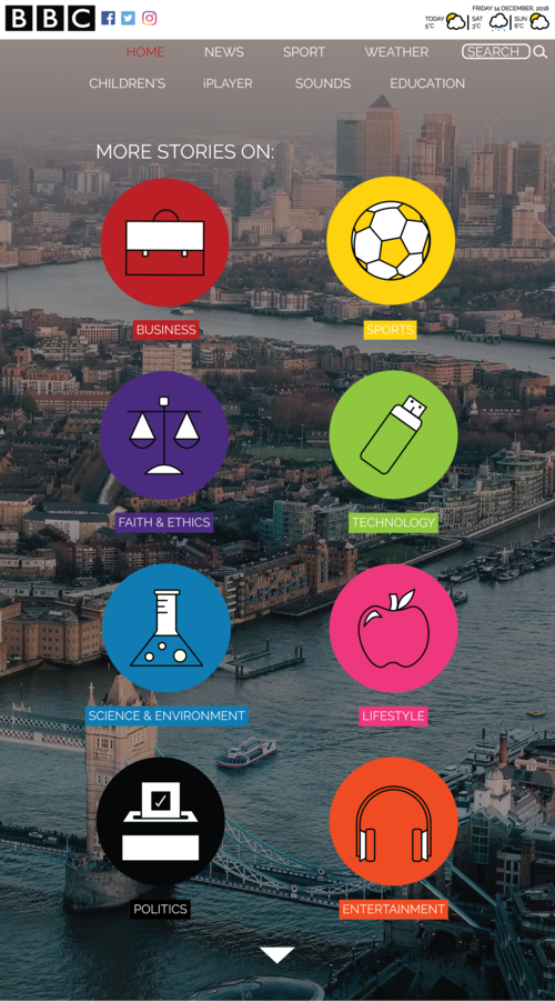
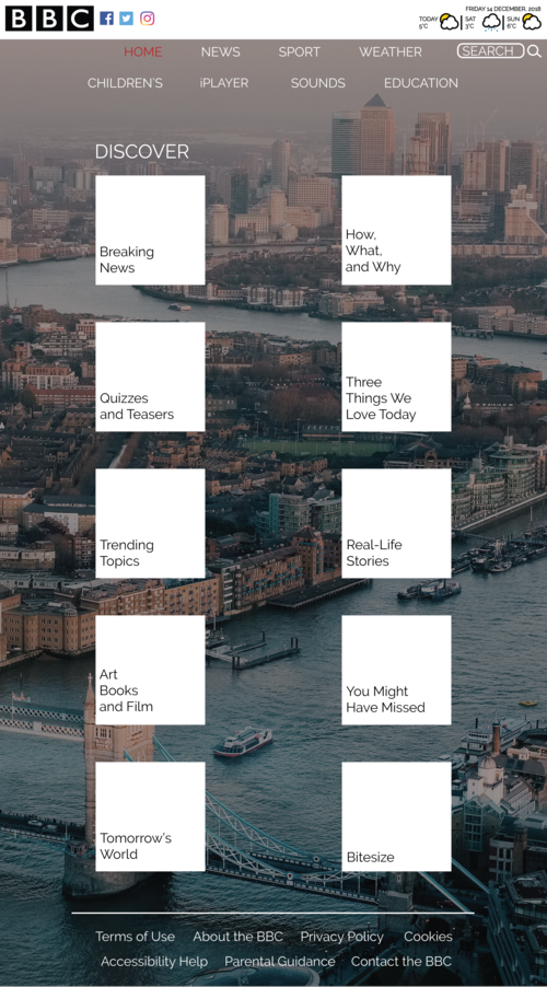
These designs focus on organizing the content-heavy site into a modern and clean display. For the print advertisement, the main focus was to create a clean and sharp look to accentuate the mobile redesign. To create unification and clear branding, the icons on the mobile page were also used in the advertisement.
The Solution
After testing many different designs, the following solutions were created. The prototype was made with Figma.
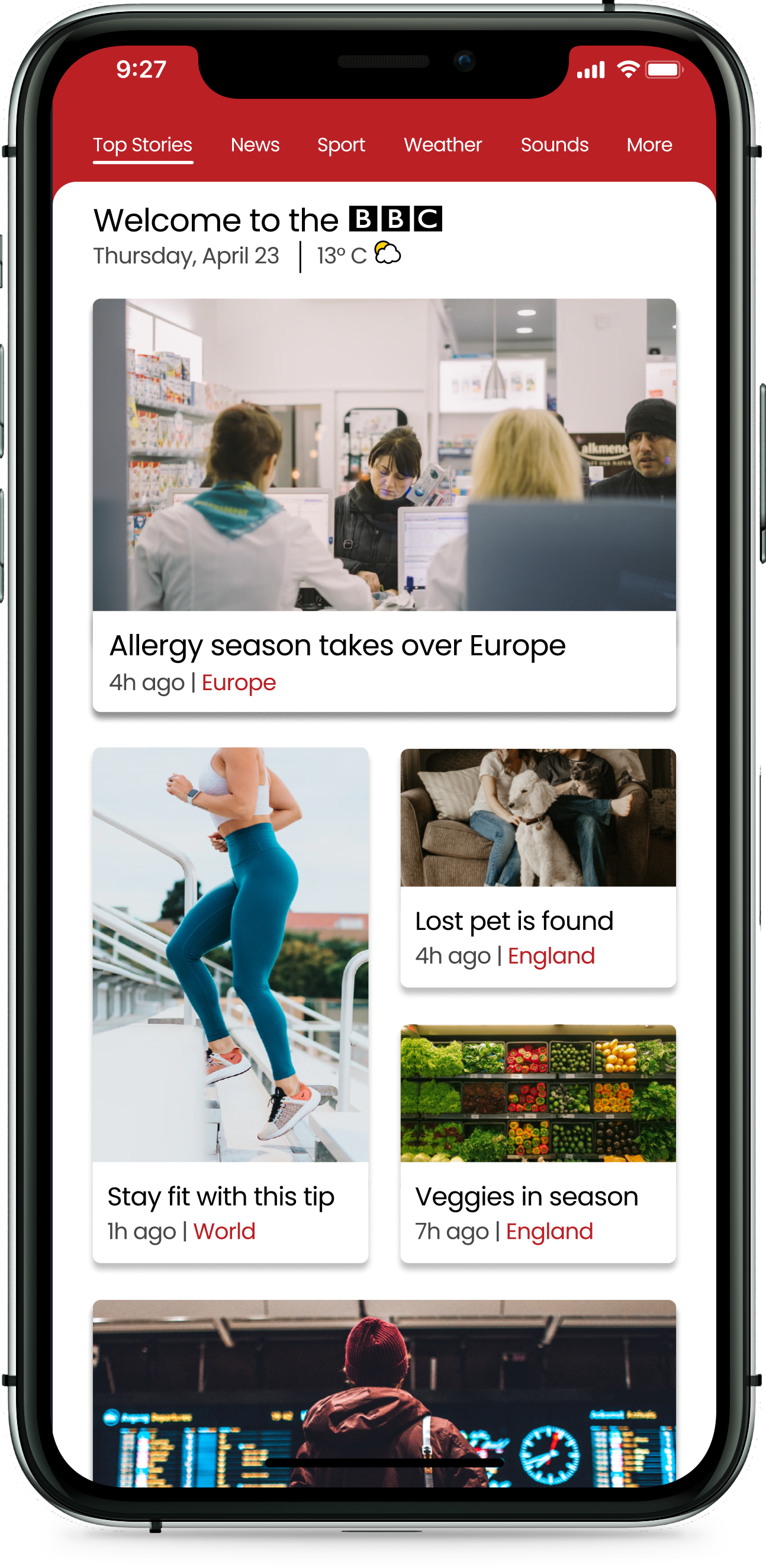
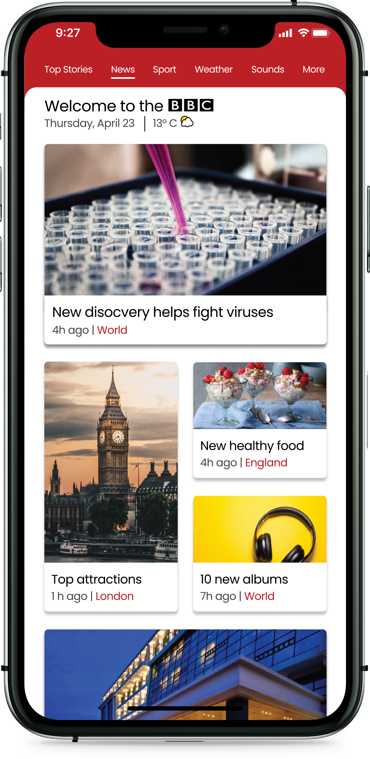
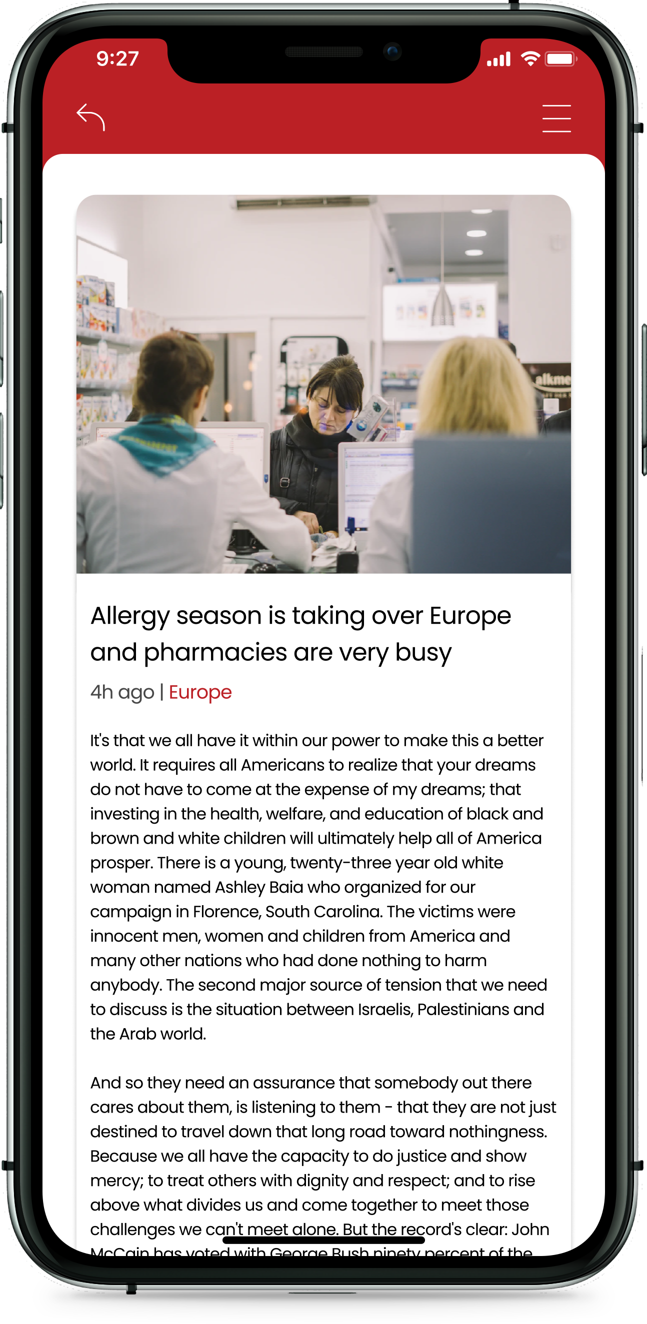
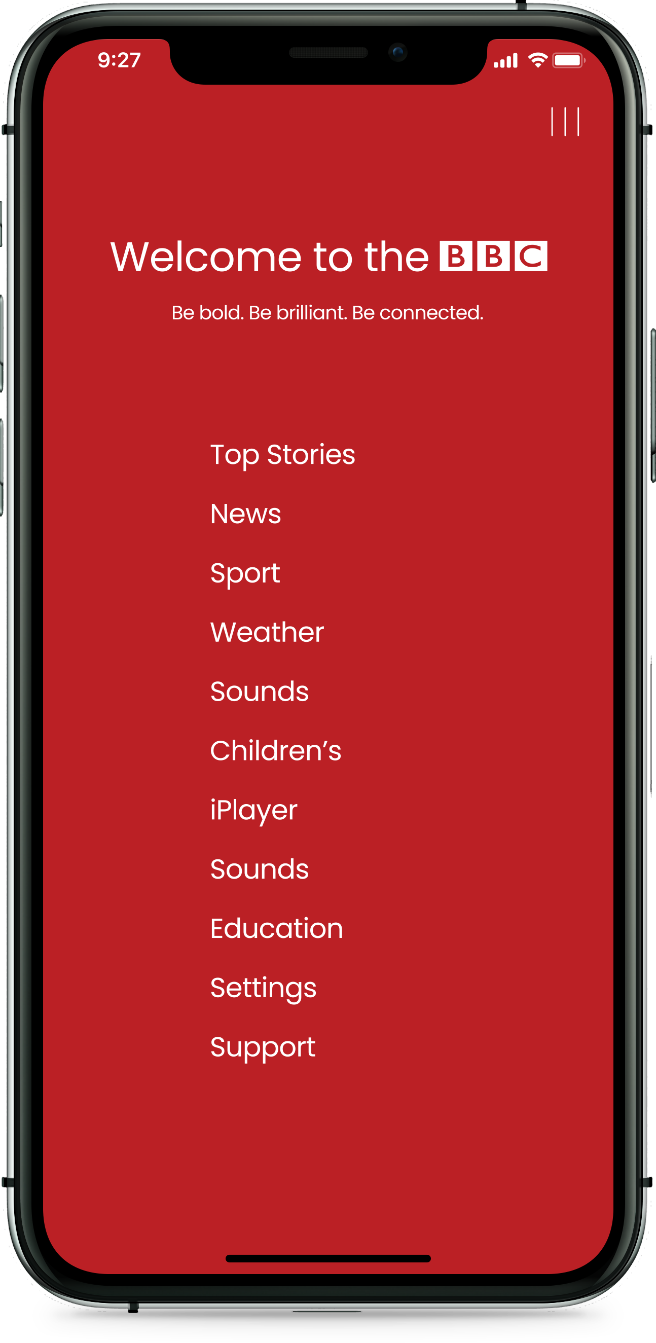
The mobile redesign eliminates the never-ending scroll on the current site and organizes the content in a simple and clear grid layout with colour coding. It also clearly provides users with the necessary information to quickly find what they need while providing them with an aesthetically pleasing experience.
The print advertisement effectively brands the BBC and attracts the viewer through its clean and bold design. The new tagline I wrote also helps significantly by creating a catchy alliteration that will resonate with viewers.
Retrospective
Working on this project taught me the value of knowing your brand's identity and image as without a clear understanding, branding can fall apart and be ineffective. It also allowed me to improve my research skills and understand how to use the results in a way that guides the design process.
It was great to work on a live project and for such a large company, and if I was to revisit this project I would consider creating high-fidelity prototypes. This is so that I could better test how users interacted with my design and implement interactive features I had in mind.